
Customizing the recipe card
Everything about how the recipe card looks and behaves is set on the Settings page in Recipe Kit. Change it once and every recipe on your store follows.
Everything here is free on every plan, except Add to Cart and Add All to Cart, which need the Growth or Enterprise plan. Compare plans on the Shopify App Store.
Layout and accent color
Under Layout, pick one of six card designs: Hero, Editorial and Classic, plus Compact, Card and Card Vertical under More layouts. The Live Preview beside the list shows the selected design with a sample recipe. Recipe card templates describes each design.
Under Accent Color, pick a preset or click the swatch to open the color picker and enter your own hex value. The accent color is used on buttons, borders, section headings and links. Use your brand's main color and check it reads well against white, since a very pale accent disappears on the card.
Features
The Features section, under the accent color, holds the switches people change most:
| Switch | What it does |
|---|---|
| Card border | Draws a border around the card so it stands out from the post. Shows only when Hero, Card or Card Vertical is the selected layout |
| Click to check | Lets readers tick off ingredients and steps as they cook. Ticked items show struck through |
| Cook mode | Adds a Cook Mode switch to the card that keeps the screen awake and strips the card back to ingredients and directions. See Cook mode |
| Add to Cart | Adds an Add to Cart button beside each ingredient linked to a product. Growth and Enterprise plans. See Add to cart button |
| Add All to Cart | Adds one button that puts every linked ingredient in the cart at once. Growth and Enterprise plans |
On the Free and Essentials plans, Add to Cart shows a Growth badge and an Upgrade button instead of a switch.

Widget features
More switches sit in the Advanced card, under the Widget Features heading. These work on the new Recipe Kit widget only. If your store still uses the original pasted-in widget, switching one on opens a prompt to upgrade first.
- Open Recipe Kit and go to Settings.
- Click Advanced to expand it.
- Scroll to Widget Features.
| Switch | What it does |
|---|---|
| Enable servings adjuster | Lets readers change the number of servings and scales the ingredient amounts to match |
| Show servings above ingredients | Moves the servings adjuster from the recipe details to just above the ingredient list |
| Show shoppable quantity selector | Adds a plus and minus stepper beside each Add to Cart button |
| Show ingredient product thumbnails | Shows the linked product's image beside each linked ingredient |
| Enable unit converter | Adds a switch above the ingredients so readers can flip amounts between US (oz, lb) and metric (g, kg) |
| Show quantities as fractions | Shows ½ and ¾ instead of 0.5 and 0.75 when readers scale a recipe. Turn it off for decimals |
| Embed inside article content | Moves the card inside the blog post's text area, for themes that put app blocks in a separate section. Works with the app block install |
When a new store finishes setup, Recipe Kit switches on Cook mode, the unit converter, the quantity selector and the product thumbnails. On stores that installed earlier, these start off.

Other card settings in Advanced
| Setting | What it does |
|---|---|
| Click to Confirm Rating | Readers click a star twice to confirm a rating. Stops accidental ratings when people scroll on a phone |
| Default Recipe Heading Type | Sets whether the recipe title on the card is an H1 or an H2 heading. Pick H2 if your theme already uses an H1 for the post title |
Print page defaults
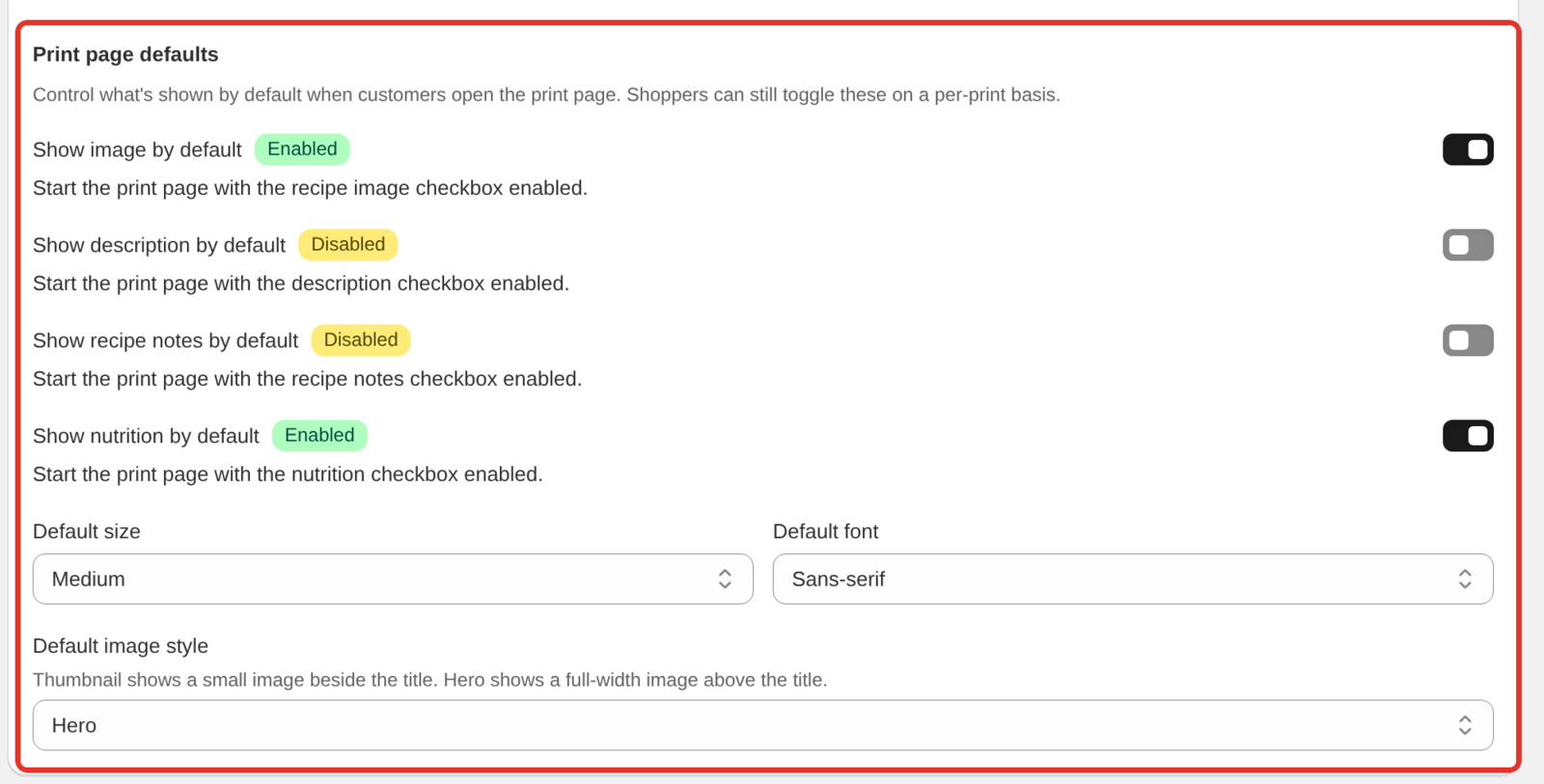
When a reader clicks Print on the card, a print page opens in a new tab. The Print page defaults group in the Advanced card sets what that page shows first. Readers can still change each option before they print.
| Setting | What it does |
|---|---|
| Show image by default | Starts with the recipe image included |
| Show description by default | Starts with the description included |
| Show recipe notes by default | Starts with the recipe notes included |
| Show nutrition by default | Starts with the nutrition facts included |
| Default size | Text size: Small, Medium or Large |
| Default font | Sans-serif or Serif |
| Default image style | Thumbnail puts a small image beside the title. Hero puts a full-width image above it |
Printing recipes explains the print page in full.
Translations and labels
The Translations & Labels card renames any text on the card. Use it to translate the card into another language, or to change wording, for example "Directions" to "Method". See Changing the text on your recipe card.
Custom CSS
For anything the settings do not cover, click Custom CSS at the bottom of the design card, under the Features section. The rules you add there apply to every recipe card on your store. The field holds up to 50,000 characters, and Recipe Kit will not save CSS it cannot read. You will see "Not a valid css" until the error is fixed.
The Recipe Kit app block in the theme editor also has a Custom CSS field, under Advanced in the block settings. Rules there apply only where that block is placed.
Custom CSS styling lists the classes to target and has tested examples.

Save and check
Click Save, then reload a blog post with a recipe on it. If nothing seems to have changed, hard refresh with Ctrl+Shift+R (Cmd+Shift+R on a Mac), since your browser may be holding an older copy of the page.
What's next
- Recipe card templates covers the six designs in detail.
- Custom CSS styling covers going further with your own CSS.
- Add to cart button covers selling linked ingredients from the card.