
Recipe card templates
Recipe Kit has six card designs. Pick one in Settings and every recipe on your store switches to it, with nothing to redo per recipe.
All six designs are free on every plan. Hero and Editorial need the new Recipe Kit widget (see Which widget you need below).
The six designs
Hero
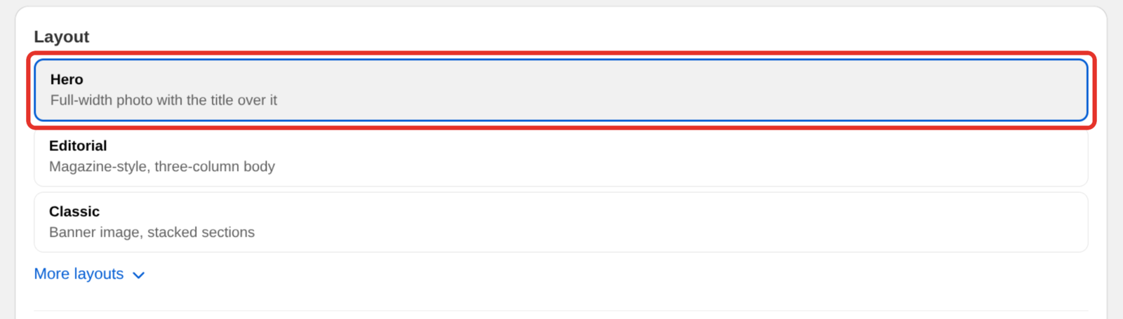
A full-width photo with the recipe title set over it. A panel overlaps the bottom of the photo with the rating, times and buttons, then ingredients sit beside the directions.
Best for stores with strong photography that want the recipe to open like a magazine spread.
Editorial
A wide photo across the top, the title and description under it, then a magazine-style body: ingredients in a side column, directions in the main column, and equipment in a second side column.
Best for long-form recipe posts where the recipe is the main event.
Classic
Banner image across the top, then the recipe details stacked underneath in full-width sections.
Best for posts where the recipe photo is the hero and you want it big.
Compact
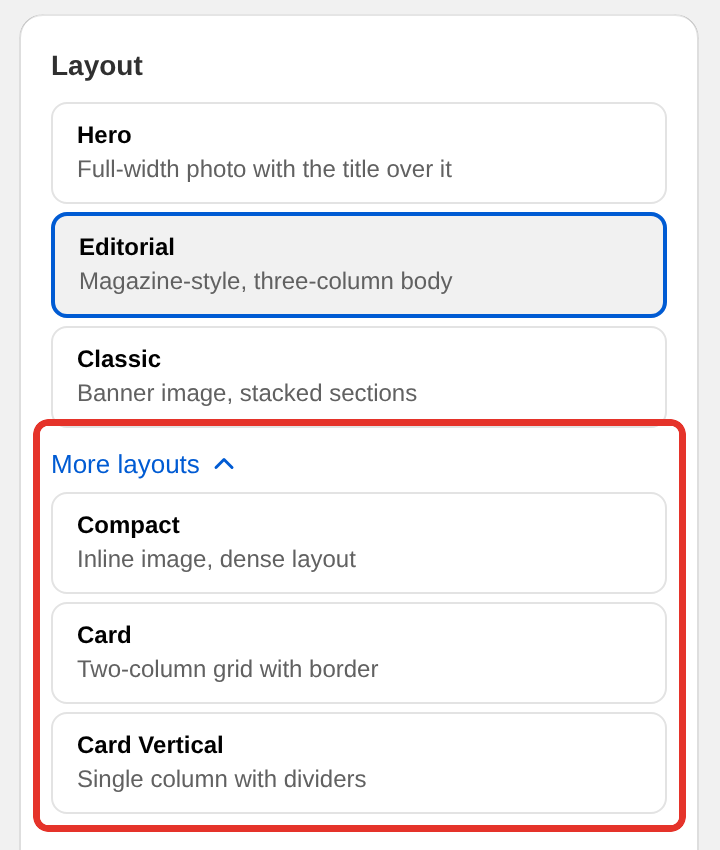
The image sits inline beside the recipe details rather than above them, and the whole card is denser.
Best for long blog posts where the recipe is one part of a bigger article and you do not want it taking over the page.
Card
A two-column grid with a border around the card. Ingredients in one column, directions in the other.
Best for recipes with a lot of ingredients, where a side-by-side layout saves the reader scrolling back and forth.
Card Vertical
A single column with dividers between each section.
Best for narrow theme layouts and for recipes read mostly on a phone, where two columns would collapse anyway.
Which widget you need
Hero and Editorial only work on the new Recipe Kit widget. If you installed Recipe Kit with an app block in the theme editor, you already have it. If your store still uses the original pasted-in widget, those two designs do not appear in the picker. Upgrading to the new Recipe Kit widget shows how to switch.
Classic, Compact, Card and Card Vertical work on both widgets.
Image sizing
Classic, Compact, Card and Card Vertical crop the recipe image to a 3:2 landscape frame, anchored to the center of the photo.
Editorial and Hero use a wider 16:9 frame, also centered. On Hero the photo grows taller when the title is long, so the title never gets cut off, and the sides of the photo are cropped to fit.
Upload at 1200 x 800 pixels and keep the subject in the middle of the frame, and one image works for every design. Recipe images, sizes and alt text has the full detail.
Choose a design
During setup
The Look panel in setup lists the same designs, with Editorial picked for you. Pick another and carry on.
Any time after
- Open Recipe Kit and go to Settings.
- Under Layout, pick a design. Hero, Editorial and Classic are listed first. Click More layouts to see Compact, Card and Card Vertical.
- Check the Live Preview beside the list.
- Click Save.
Every recipe on your store updates to the new design at once.
What each design shows
All six designs use the same recipe data. They differ in where things sit, and a few details appear only on some designs. The cuisine and category label above the title appears on Hero and Editorial. Hero and Classic show the author under the title, and the other designs list it with the recipe details.
Always shown: recipe title, image, ingredients, directions.
Shown when you have filled them in: description, prep and cook time, servings, author, cuisine, category, equipment, nutrition, recipe notes, FAQs, rating stars, video, custom fields.
Interactive parts: print, share, ratings, click to check, servings adjuster, unit converter, quantities shown as fractions, cook mode, and Add to Cart on the Growth and Enterprise plans. Most of these are switched on or off in Settings. See Customizing the recipe card.
Customize a design
Every design picks up:
- Accent Color, used on borders, section headings, icons and buttons
- Custom CSS, for anything else
Hero, Card and Card Vertical also have a Card border switch in the Features section of Settings.
Customizing the recipe card covers the settings, and Custom CSS styling lists the class names to target.
Mobile
All six designs reflow on their own for tablet and phone widths. Two- and three-column layouts collapse to one column on narrow screens. There is nothing to configure.
Preview before you commit
The Live Preview in Settings shows the selected design with a sample recipe. To see a design with your own recipe in your own theme, save it and load a real blog post. Switching back changes nothing about your recipes.
What's next
- Customizing the recipe card covers the accent color, border and feature switches.
- Custom CSS styling shows how to change a design beyond the settings.
- Recipe images, sizes and alt text explains how to get the image crop right.